
BMI vs. Body Fat : 無料・フリー素材/写真
BMI vs. Body Fat / syvwlch
| ライセンス | クリエイティブ・コモンズ 表示 2.1 |
|---|---|
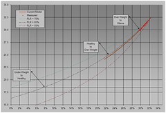
| 説明 | This is a plot of the Body Mass Index vs. the Body Fat percentage. It includes the actual measurements over the 11 weeks of my diet so far (the little red crosses), as well as some guesses about where this is going next.Obviously, I started in the upper right-hand corner (with a BMI around 32.5 and a Body Fat percentage of over 32%!) and as the diet progresses, I'm moving down and left. You can see the measurements just hit the transition between Obese and Over-Weight as per BMI.The most important parameter impacting the shape of the curve is the Fat Loss Ratio (FLR), i.e. the percentage of weight loss that is actual fat loss (as opposed to muscle loss).The thick brown line is the model's best guess as to where BMI and Body Fat are going next, based on my historical average FLR value (i.e. 63.06% as of today), while the dashed lines show where the curve would lie for other values of FLR.For the record, I expect FLR to change as I continue to lose weight and/or make an impact on my muscle loss, but it's interesting to see how wide a range of possible Body Fat ratios could potentially correspond to the various BMI threshold values.Lastly, these BMI and Body Fat values are valid for me, right now. I doubt they have any predictive value for anyone else, especially if they are not a 35-year old male. |
| 撮影日 | 2009-03-20 11:59:12 |
| 撮影者 | syvwlch |
| タグ | |
| 撮影地 |